Tuesday, September 4, 2012

eeek!


I always admire people who use nontraditional colors for holiday cards, so I thought I'd try it myself with the color palette at the Play Date Cafe Challenge this week. 


Although it isn't too much of a stretch to get "witch" out of these colors, I probably wouldn't have used them together if it wasn't part of the challenge (especially the evergreen, I would have just made the hat and boots black, and how "not fun" is that?)
 
I've also had the Moxie Fab World challenges in my head from their new handbook:


If you haven't gotten a chance to check them out, I would highly recommend it. I felt like I was going back to school just like my kids this week! Really basic lessons/reminders you can apply to everyday card making. 

 
I started out using the focal point challenge and drawing the spiderweb in the background to call attention to the witch (the focal point) in the center of the card. Please excuse the messy web, I was just playing around to see how it would look with the intention of redoing it later, but then I changed direction slightly ...


and made the web off center using the principles in the asymmetry challenge. To balance it a little I added the spider. Once the spider got on the card, I thought it would be kind of funny/ironic to have the witch scared of it, so that's where the "eeek" came from. Originally I was just going to use a "Trick or Treat" sentiment underneath.


Then the lessons from the movement challenge came to me and I wanted to incorporate these too. So, I colored a streak in her hair and restamped/tilted the spider body. Here's the movement I was trying for:

 
  1. start at the wide, white, witch eyes;
  2. from the eye, follow the purple streak in her hair, the purple arm, and the point on the frame across the line of the spider web;
  3. stop at the dotted line going down, and follow it to the spider;
  4. follow the spider's eyes across to the witch's reaction upon seeing it, "eeek!"
  5. done. loop is completed, eyes can rest : )
  So, did that work? I like having the spider body look back at the witch instead of up and off the top of the card. I knew that principle from so many years of scrapbooking (not having pictures of people looking off the page) but somehow I totally forgot about that when card designing. It was fun doing a mini makeover on my witch card using the Moxie Fab Challenges!

Thanks for looking!
-Kelly

Supplies used:
stamps: My Mind's Eye Blackbird Stamps, PSX alpha
dies:  PTI Fillable Frames
ink: Spectrum Noir Markers

Friday, August 31, 2012

Love You to the Core


Here's an apple card for this week's back-to-school challenge at CASual Fridays:


As Jenny mentioned, I've never sent a back-to-school card (although maybe that would make my 3rd grader a little less sad about the prospect of his fun-filled, lazy, summer days coming to an abrupt end) so I used a classic school icon instead. The apple.


The outside shows the whole apple (patterned with a Martha Stewart stamp) with just a "love you" on the leaf. When you lift the flap you see the inside of the apple and the rest of the message.


 Glossy accents are on the black seeds (the glossy accents on the right seed kind of collapsed when drying, so I guess that one is a dried seed!)

 Thanks for looking!
-Kelly

Supplies used:
stamps:  PTI Tiny Tags, Martha Stewart Backgrounds
impression plates: PTI stripes

dies:  Memory Box Delicate Chain Border, Cricut
other: glossy accents

Thursday, August 30, 2012

Lemonade Stand Banner Card


 With two challenges this week on banners, I was motivated to make a card. And have it be a summer one while I still can.


Make It Monday's challenge is to make a garland.


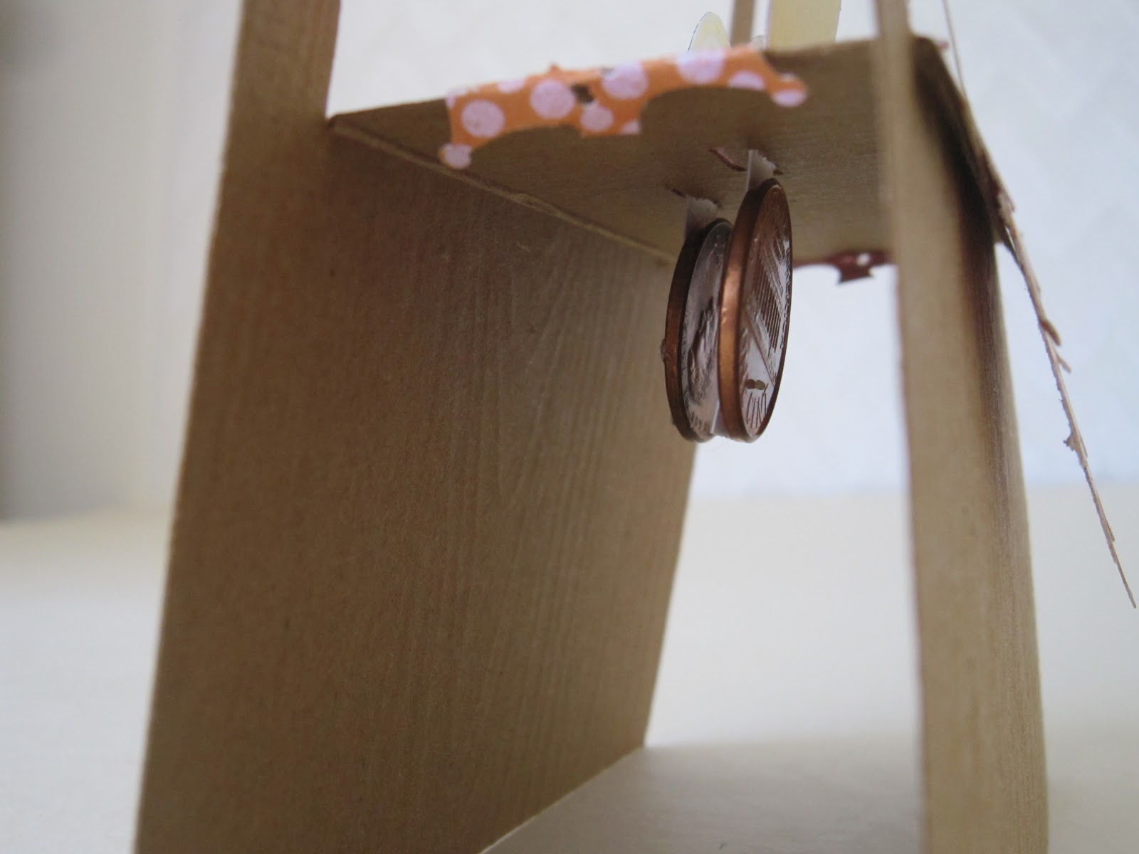
For this card I just cut out the center, but left a flap which will be the top of the lemonade stand table when it's opened.
The banners are strung between the two posts. I found several great packages of 1970's beads from a recent flea market, and am happy to use the lemon yellow ones right away in between the banners.


The lemons are from PTI Tiny Treats. I didn't have a lemonade pitcher stamp so I drew one and colored with my new alcohol markers.


 There is a tab on the bottom of the lemons and lemonade. I cut slots in the table top for the lemons and adhered pennies to them underneath so gravity would make them stand up when the card is opened.


Then when it's time to slip the card into an envelope, lift the table top flap, and everything folds flat.


The table cloth is made from a Martha Stewart punch. I'll put a tiny note on the front with the sentiment and attach it with a brad once I decide what I am using this for.

Thanks for looking!

[ETA: This also fits with the CASology theme of "Relax" this week, just what I want to be doing!]


Supplies used:
stamps:  PTI Tiny Treats
impression plates: PTI woodgrain
dies:  PTI banner builder
ink: PTI true black
other: MS border punch, baker's twine, beads, pennies, Spectrum Noir markers

Saturday, August 25, 2012

Tweed Purse


It never fails. One week you're thinking beach/sun/flip-flops, then school starts and immediately you jump to apples/blankets/Halloween. 

 Then you have all the cozy, fall inspiration from the Papertrey Blog Hop:


This purse project is inspired from these lovely fall textures, and the Make it Monday challenge to die cut fabric. 


This tweed is die cut with the Favor It 1 die. I cut off the die cut handles, notched them at the base, and substituted real leather straps. The sewing was a little challenging for me, but let's just say as the author of this blog post I reserve the right to only show you the better side : ) A metal monogram is an easy way to personalize it for a gift.


Also, if you are using this for a gift idea, take advantage of the 3D pocket area. It's the perfect place to fill with money. Roll the money using a bamboo skewer for something a little different.


 If you are using this for a 30th birthday present you can roll 30 one dollar bills. The same works for a 20th, 40th, etc. birthday. 

Thanks for looking!
- Kelly


Supplies used:
dies:  PTI Favor It 1
paper:  Pink Paisley

other: leather lacing, metal letter, brad, tweed fabric

Tuesday, August 14, 2012

Sock Monkeys: Post on Inspired By Family


Hope you all are enjoying the last weeks before school starts! If you get a chance, I'd love for you to stop by Inspired By Family and check out my article on making multiple cards with one stamp. I picked up this sock monkey stamp set at a garage sale and had fun playing with it.

Initially I was inspired by CAS-ual Friday's challenge to make square cards.

Then after making the cards I saw the Make It Monday challenge to use stitching on a card. I redid one of the cards and stitched the pom-pom on his hat:


Thanks for looking!
-Kelly

Thursday, August 9, 2012

7th Birthday Card for Boy/Girl Twins


Here are a few more cards inspired by the super-cool typewriter from the Tuesday Trigger.


I know, there are no typewriters to be found on these cards. The inspiration is from the colored keys. I was thinking, "what part of an image do I have that is always, without a second thought, colored black so I can substitute colors?" Numbers on a traditional pocket watch!  


I carefully inked each number with an ink pad, except I was able to use a stamp marker for the yellow numbers. Then die cut a thick acrylic circle (from Cricut Cartridge packaging) to put on top of the clock face. I wanted something with a shine, and initially used dimensional glaze. Yuck!! It turned the colored numbers into a soupy mess. I'm embarrassed to even show a picture of that.

This card is for our dear niece, so I put a gem brad in the middle, and used the fancy watch hands. Notice they are pointing to 7:00 ... she's turning 7. Of course you could do this for any age, up to 12 years old.


This card is for our handsome nephew. Also turning 7 years old. Instead of messing around with the numbers which are supposed to be black, I took what is supposed to be white, and added color to that. 


The normally white watch face has ink sponged around in a circle like the tie dye technique that was featured at PTI Stamp-A-Faire. Since this is for our nephew, I didn't want to use the fancy watch hands, so I drew plain, straight ones. A screw brad holds everything down in the middle.


Thanks for looking!
-Kelly

Supplies used:stamps:  Pink Paisley Soiree, AC chevron, old wood block watch 

dies:  PTI fillable frames
other: acrylic, screw brad, gem brad

The Creative Type


Holy smokes, this is such a cool typewriter in the Tuesday Trigger challenge at the Moxie Fab World! I saw a 1930's typewriter on etsy like this and apparently the keys are colored to help with finger placement. I'd rather think that they made it like this just for fun!

The photo inspired me to play around with the theme of "creativity" and the kind of out-of-the-box thinking someone had to make the keys in a color other than black. In my head I had a picture of a blank typewriter page with flourishes and doodles coming out from behind it to symbolize the endless possibilities that await that page, or really any project, right before you start.


It turned out pretty close to what I pictured. Ideally I'd like to have the quote centered under the typewriter on the white cardstock, but I ran out of real estate. That's OK. Three rhinestones are on the keyboard, radiating more creative energy.
 
 
 There are several inspirational quotes that I love, and I couldn't pick just one, so I figured a set would be fun to make. It was fun to play around with the different doodle stamps. You could make 20 of these and they'd all be unique.


Thanks for looking!
-Kelly


Supplies used: 
stamps: Heidi Grace
ink: PTI Pure Poppy, Hawaiian Shores, Color Box Yellow Ochre
other: rhinestones