Sunday, February 26, 2017

Adult Coloring Book Birthday Cards


Hello! Today's set of cards were inspired by rainbows and adult coloring books. They feature the CAS-ual Fridays Shenanigans birthday sentiment, and the detailed Pretty Posies floral stamps.


I was trying to develop some energy from contrasts in this card. The first contrast is between the intense, warm colors of the repeated sentiment, and the starkness of the black and white flowers. Also, the thinly drawn details in the flowers contrast with the boldness of the text.


Although it took me awhile to come up with the design, once I did it was easy to replicate. I took an extra 15 minutes to make a few more cards.


I like the boldness of the top vs. the femininity of the bottom. Just perfect for my girlfriends!
    

These cards are over at the CAS-ual Fridays Stamps blog today if you'd like additional information. Feel free to use my code "KELLY2017" which will save you 15% off any purchases at CAS-ual Fridays Stamps.

Thanks for looking!
-Kelly

Tuesday, February 21, 2017

February 2017 Essentials by Ellen Release Hop

Welcome to the February 2017 Essentials by Ellen Release Hop! I’ll be showcasing several of the new products on my post today! It’s a good thing you are here because I’m giving away an Essentials by Ellen stamp set!  The winner may chose any in stock Essentials by Ellen brand stamp set  (Maximum value $25 USD) at Ellen Hutson.com  To enter, please leave a comment on today’s post by Tuesday, February 28. There is also an AMAZING Grand Giveaway on the CLASSroom!  To enter, be sure to leave a comment there, too, by Tuesday, February 28.
ALL winners will be announced at the CLASSroom on Friday, March 3Please check there on that date to see if you are a winner and for further details on claiming your prize. Happy hoppin’!
You may have come from my dear blogging friend, Michele Ferguson, but if not feel free to start at the beginning in the CLASSroom.

I was so excited to be assigned the Otterly Awesome stamp and die set, especially since it's very similar to the All Inside Bear stamp and die set that I went nuts over in the Winter 2016 blog hop. My initial plan was to show 5 ways to use this adorable otter, but I got so intrigued by the Hinged Thanks Die that instead I decided to do ...

 FIVE different ways to use the Hinged Thanks Die


  1. Add colors underneath each letter.
  This method works with any card design! Just pull a few colors from the rest of your card, and add them underneath each letter. You can do this by cutting out small blocks of colored paper to put underneath, or simply color the spaces underneath with a marker. Such an easy way to tie in your sentiment to the rest of the design of your card.


  2. Die cut on different colored strips of paper.
 This can quickly be adapted to your recipient. The colors used on this card result in a masculine card, but you can just as easily pick pinks and oranges for a feminine card. 


The fun part is picking which color to go underneath the die! I opted for a bright orange to really contrast with the blue (they're opposites on the color wheel). Love how this die lets you easily add a "hidden" surprise element to your design.
 

3. Die cut right in the middle of your design
 So fun making a pattern with the nail polish bottle from Make it Beautiful! After coloring all the nail polishes, and then coloring in the negative spaces with dark gray, I held my breath and sent it through the die cutting machine. You really only get one chance with this! But it sure does look great once it works out. Not sure if you noticed, but all the nail polish bottles are spaced so that each letter would be a different color.


 Here's the view from the side. Love how this die automatically gives your card dimension, without any additional bulk whatsoever. It's the best of both worlds!

 
4. Mix up the letters
  Just because it's a "thanks" die doesn't mean you have to use it to say "thanks." There's nothing stopping you from cutting up the letters and making your own sentiment, like Santa! I'm sure you've all seen the simple Santa cards that just use red, white and black cardstock to make Santa's suit, but putting a sentiment on those cards without ruining the simple design is quite challenging. Problem solved! Cutting the hinged thanks in black doesn't interfere with it being Santa's belt, yet it still gets the message across in a subtle way.

5. Use it on a Bendi card.
 Before getting into this method in regards to the Hinged Thanks die, let's pause for a moment to soak in all the adorable otters from  Otterly Awesome and Otterly Awesome Dies and their accessories from Otter Ware and Otter Ware Dies! Awww! I admit there's a lot more going on than I usually have on a card, but I really wanted to include it all! I mean c'mon, otters holding sea shells and sea urchins?! Cuteness overload. The wonky circles and scallops in this ocean are from another new set in this release, Wonky Backdrops.

 Back to the Hinged Thanks die, this method really highlights the unique feature of the hinged letters. Putting the sentiment on the curve makes the letters stand out even more! Another difference on this card is that the actual letters are colored in a different color to help them stand out from the background. I just put a piece of paper underneath the letters when coloring the letters to make sure I didn't get stray marks on the background. 


 Well there you have it, folks, five different ways to use this unique Hinged Thanks Die! I'm so glad you stopped by! I hope you've been collecting ideas as you hop along, and are narrowing down your wishlist from this latest release. There are so many goodies to choose from!

Your next stop on this inspiring blog hop is the delightful Sharon Harnist!


*note: affiliate links are provided below, which simply means if you make a purchase I receive a small financial incentive, at no additional cost to you.

Friday, February 17, 2017

Calling All Sistahs - Emboss on Ribbon

  
 Hello! Welcome to the Calling All Sistahs hop! Along with it, a friendly reminder to check yourself and/or schedule your breast exam. My card today features an actual ribbon of hope, along with the sentiment embossed directly on the ribbon. Because why not?! I love that it looks like a custom breast cancer ribbon. Holding the ribbon together in the middle is a pink flag pin from a set I got at the Target dollar spot awhile ago. And two of the Calling All Sistahs sequins from the limited edition special mix.

  
The corner of the card is masked, and then sponged with ink. The Tin Roof background stamp is stamped in fuchsia first, and then topped with a layer of white embossing to give it a more distressed feel.


The shaded area purposely follows the same angle as the ribbon, and the three strips of silver glitter tape


You may have come from Lori Kobular's blog. If you'd like to start at the beginning of the hop, head on over to the CAS-ual Fridays blog.

Should you be interested in purchasing anything from the Calling All Sistahs line, 50% of the profits  are donated to National Breast Cancer Foundation. You are also invited to participate in next month's blog hop. Check out all the details at CAS-ual Fridays, along with information on prizes.

Don't forget the discount code KELLY2017 to save 15% off your purchases! 


Your next stop is Gwendolyn Goh who has a super colorful creation to share with you!
   
Thanks for stopping by!
-Kelly

Wednesday, February 15, 2017

Join me in the Stencil Challenge!

Hi Folks! I'm excited to share a project on the Winnie & Walter blog today!


It's another one that features stencils, going along with the Stencil Challenge on the Winnie & Walter blog. 

Hope to see you there, or better yet, in the gallery of one of the Winnie & Walter birthday challenges! You have all month to dream something up, and then make it so.

 Winnie & Walter, LLC

Thanks for looking!
-Kelly


Wednesday, February 8, 2017

Perfect Reason Stamp Of Approval Release Day

Hooray! Release day! The Perfect Reason Stamp of Approval is now available!


To celebrate, I decided to try filling the entire card with the inspiration photo that this stamp set is based on, just to see if I could do it (psst ... there will be something special included with the collection that is VERY SIMILAR to this pattern to help you stamp.) It's a continuation of the card I made for the blog hop.


In the spirit of full disclosure, I admit that I got a little cocky and didn't press on the middle of the bird's body well enough. I think these inks have made me a little lazy!! I don't stamp nearly as hard as I used to ... you'll see a few spots near the pink bird's neck where I had to go in with some colored pencils to help hide.


But otherwise, again, the coverage with Catherine Pooler's ink is amazing. And these solid stamps are perfect to take advantage of that.


It didn't take me as long as I thought, especially since I had a little guide. It was like coloring by numbers, only with stamps! The detail I like the most is the grouping of tiny blue dots around the peacock feathers. It's great to break up all those orange shapes.


Just for fun, I took a photo of the aftermath, before I put all the stamps away from this card. Some blocks had five different stamps on them, front and back! I think I counted 22 stamps total. Good times!

Here's one more quick card to share. It uses the funky design from Everyday Mod, stamped in Tiki Torch once, and then two more times until I got to the end of the card (without reinking). Same thing on the other side of the sentiment. "Blessing" is stamped in Aquatini, as it's opposite from orange on the color wheel.

Sure hope you enjoyed all the projects from the entire design team this week! The collection is available at Catherine Pooler Stamp of Approval. Can't wait to see these designs around the internet. 

Thanks for stopping by!
- Kelly

Fabulous Peacock - Stamp Nation Challenge


 Now that the Perfect Reason Stamp of Approval collection is available for sale, we are celebrating with a challenge for Stamp Nation members, based on this inspiration board:


 I think it's probably easy to see how I was inspired here, it's a peacock! The border stamp is from this collection, as well as all of the mix 'n match sentiments. I stamped the peacock a little differently this time ... instead of using the long train of feathers going down the card, I stamped three paisleys to represent the colorful feathers. Love that the insides of the paisleys are separate so you can use a bunch of different colors to make your bird.
I made a mask inside the paisleys to get some shading on the bottom of the feathers. That, combined with the sequins from Lucy's Little Things, add more color to this pretty peacock. 

If you're a Stamp Nation member, I hope you get a chance to play along with this challenge. If you're not a member, feel free to check them out!

Thanks for looking!
-Kelly

Monday, February 6, 2017

Stencil Challenge with Winnie & Walter: Join Me!

Hi Folks! It's Winnie & Walter's 3rd birthday, and to celebrate we are hosting several challenges on their blog. Get inspired, share your work, win some prizes ... what's not to love?!

My challenge can be simple or more involved: Make a project using a stencil.

So many different ways to get creative with a stencil. Enhance a focal point, be the focal point, use multiple stencils, shift your stencil, flip your stencil over, make your own stencil, the list goes on and on.


Here's a card I made by stamping through a stencil. So many different possibilities!

I sure hope you're inspired and will give this challenge a try over at Winnie & Walter. I can't wait to see what amazing things you all come up with!

Thanks for looking,
-Kelly

Sunday, February 5, 2017

The Perfect Reason Stamp of Approval Blog Hop Day 1


Welcome to the first day of the Perfect Reason SOA blog hop! You were most likely just wow'd by the fabulous Emily Leiphart, but if not feel free to start at the beginning with Catherine.

If you're not familiar, the Stamp of Approval box is a collection of products which are all exclusive to Catherine Pooler designs, so you won't be able to purchase them anywhere else. They also are only available as a whole collection and won't be offered individually for several months. If you need to start playing with these goodies, I would recommend that you subscribe to the wait list at Catherine Pooler Stamp of Approval so you're the first to know when it's available. You don't have to pay anything to subscribe, you're just billed if and when you decide to buy the collection. Historically, the collections have sold out rather quickly. 

Now onto the projects!


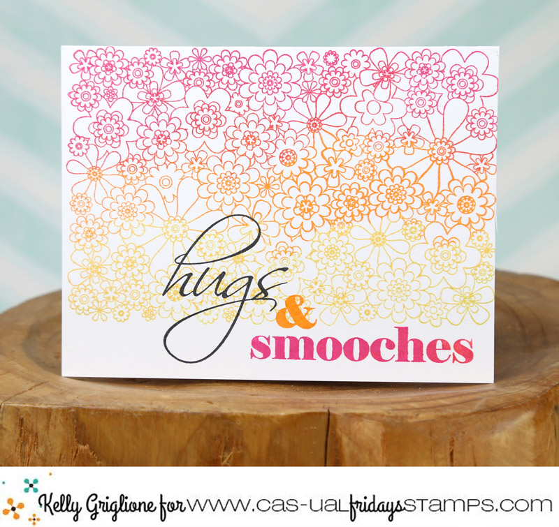
I'm not going to lie, I really love this card. It makes me happy. I still have it out on my desk even though I finished it last week. There are two reasons why: 1) the stamps, and 2) the inks. The highly detailed and stylized design is so unique, I'll go out on a limb and guess that you probably don't already have anything like this in your stash of stamps. The image is broken up into different stamps to allow you to easily use different colors (could you imagine if this were just one stamp, how different it would look?)


Also, the new Catherine Pooler ink is out of this world. Crazy good. I've been using it almost exclusively for over a month now and I don't see myself stopping any time soon. The colors are nice and bright, and the coverage is simply amazing. There really are no gaps in coverage. No pesky white spots to tear your hair out over.

And, I did not use a MISTI, at all. Each stamp is one and done.


 This card uses the same stylized seed pod flower, in different colors, to give pizzaz to the sentiment. I love mixing fonts, and this collection has quite a few options, including a basic "sending" (which works with just about any sentiment ... sending birthday wishes, sending thanks, sending sympathy, etc.) and a lovely scripted "congrats." As well as mixing fonts, I like to stamp them in different colors, usually black and a pop of color.


The stencil works well to add something extra in the background. I blended some Tiara and Lime Rickey ink right over the flower and sentiment.

A few drops of gold glimer mist and I called it done. Bonus that it's completely a one-layer card.


You've made it to the end of today's hop, but there are still two more days of hopping. There are a ton of stamps, dies and stencils in this collection to keep you busy for quite a while; you will love it all!

PRIZES: Comment on all the blogs in the hop to be entered to win the entire box (you get refunded if you've already bought the box). Winners from each of the three days will be announced on Catherine Pooler's blog on February 9th

*** On a personal note, I just started using Instagram and Facebook for my blog this week! Hooray! If you like my work, I would greatly appreciate it if you'd consider following me (links on side bar.) Thanks!
 
Thanks so much for stopping by!
-Kelly

Blog Hop:
7. Kelly Griglione <- you are here 

Saturday, February 4, 2017

CFS Release - Daisy Chain, Full on Floral


Full on Floral! The latest in the CAS-ual Fridays release is quite appropriately named, I think. After playing around with some color combinations, this card was super easy to create. Another good possibility for gifting as a set of cards to someone. It's quick, since there's just one main stamp to ink up, but it still has a large impact due to its size.

 
The sentiment is from a previously released set Mwah. I repeated the orange in the flowers for the ampersand, and the pink in the flowers for the "smooches" to tie everything in. I love that the floral ends partway down the card to give you room for a sentiment. I always feel somewhat accomplished when I'm happy with a card and it's truly one layer.


I've got one tip to share on making the most of your mistakes: if it doesn't turn out right the first time, flip it over and start again. This was my first attempt at the card, where I inked the floral stamp in red, orange, yellow and green. When I got ready to stamp the sentiment on the bottom of the florals, I was stuck at what color to use that wouldn't get lost in all those lines. Nothing seemed to work, especially since the sentiment I wanted (hugs) has thin lines itself. I concluded that I had to omit green from the stamp so the low contrast yellow would be on the bottom and not compete with my sentiment. Instead of throwing it away, or saving it for a later use that will never come, I just flipped it over and stamped on the other side. Now I have a perfectly coordinated design on the back of my card. I'm pretty sure whoever receives will think it's an extra detail, and not realize it's actually a mistake.

   
Well that's it, folks! You've seen all the stamps and now they are ready for purchase in the CAS-ual store! Feel free to use my code "KELLY2017" which will save you 15% off any purchases, including this new release, at CAS-ual Fridays Stamps.
  
Thanks for looking!
-Kelly