Friday, March 31, 2017

CFS March Release Blog Hop


Hello Folks! Welcome to the CAS-ual Fridays March Release blog hop, where you may have come from one of our special guest stars Nicole Picadura, or you can start at the beginning at CASual Fridays.


This card uses a new set called Modern Petals to build the background. Although it has "petals" in its name, it can absolutely be used for a male card by changing the colors, due to how stylistic it is. I stamped the main pattern in Lime Rickey from Catherine Pooler Inks and then chose a few different cool colors to stamp the middle designs with. Lots of flexibility here.

The sentiment is from the return of the retired, revamped Rad set. One of my favorites that I was sad to see go away because of all the teen boy words that make me look as current as any soccer mom can hope to be : ) The hashtag is a nice addition.


Here's another card that features many of the sentiments from Rad. I used a watercolor wash to highlight the adjectives and then spattered some ink to match with the grungy font


This card uses the hot air balloon stamp from Floating. But wait, where are the hot air balloons?! I did some stamp surgery and removed the strings and basket from the balloon of flowers. Now it's a circle of flowers! Perfect for backgrounds. Trust me, I'm a nervous surgeon, and don't take scissors to my stamps lightly. But, with this design, the thin lines of the rope don't need to be exactly lined up on a specific place of the balloon. There are so many little lines with all the flowers that as long as it's close you'll never be able to tell that it's now two stamps.


The sentiment is from another new set, So Pretty. It's got a ton of sentiments, all in the same scripty font. I think it goes well with the explosion of flowers from the hot air balloon.

We're doing something a little different for this release! In addition to hosting a blog hop showcasing all the new products, they are now all ready to be purchased. No more waiting! I really don't like waiting. Before you head to CAS-ual Fridays to make your selections, don't forget to grab the coupon code KELLY2017 to save 15% off everything, including the new release items!
 

Five $20 gift cards will be given away to random commenters across all the stops on the blog hop, and there will be one grand prize winner of a $50 gift card. Someone could sure do a lot of damage with $50!

Your next stop on the hop is the wonderful Jeanne Jachna who undoubtedly has something fabulous to inspire you!
    
Thanks for looking!
-Kelly

Concord & 9th - 10 Cards, All Featuring the Same Embossed Panel


Hi Folks! I figured I should come right out and show you the photo of everything in this post right away, so you know what you're getting into. Hahaha!


All of these cards start in the same way ... running a panel through the die cutter with a rubber pad underneath and without one of the plates so it embosses instead of cuts. The die is the new Double Cut Alphabet Dies from Concord & 9th. Love, love these dies!! They have an outline as well as the actual letter, making for a ton of different combos. But before I cut all dies apart I wanted to explore this embossed panel concept. And more specifically, focusing on specific letters to integrate with the sentiment. Let's take a closer look!


For this card I smooshed ink onto the base and stamped "friend" from You are Here before I embossed it. This just made sure that the ink went on evenly. I knew where to position the "friend" based on lining it up in my MISTI from another panel that was already embossed. Very helpful!


To highlight the "H" and "I" for "Hi Friend" I used both the outline cut and the inner letter cut. Love the extra definition it gives your letters. For further dimension I used the Background Blocks set to stamp a pattern on the inner letters.


Even on just a plain white background, these dies make an attractive embossed pattern. The outline feature of the dies make for a lot of extra bumps and valleys. I used 110# cardstock to increase the definition of the embossing. You really just want to touch it a couple times!

Pretty straightforward here ... I cut out my own heart and sponged ink through it around the "U" since that is part of my sentiment. Like the last card, I stamped "Love" from the Faith and Love set before embossing it so there wouldn't be gaps in the ink. Then I cut the panel on an angle and attached it to the card base.


This card also uses the "U" for the sentiment, but this time I added "Miss" from Fill-in Phrases. I wasn't sure about heat embossing it and then dry embossing it afterwards, thinking that the white may crack under the pressure, but it held up well.


Because of the meaning of the sentiment, I removed the "U" with my exacto blade. So it's actually missing! I cut it from the back of the card as well so you can see through the entire card. Here's where the outlines come in handy. Adding the white "U" outline not only ties in with the white "Miss" to make the sentiment readable, but it also hides my imperfect cutting. Win, win!


This one is a challenge! Can you figure it out!?

I'll give you a hint, it's for my good friend BRENDA who just drove 3 hours to go to the Green Day concert with me on Tuesday.


You start with the letter that has the sequin attached to it, and then follow the sparkly gold thread to each of the next letters. B-R-E-N-D-A. Get it? Again, something that couldn't really be done without the outline feature of these dies. The sentiment "you are a rare find" from You are Here is really what gave me the idea for this card design. I was thinking of how to make a sentiment that you had to find, by putting all the letters together. Like a secret message! Looking forward to giving it to Brenda and seeing if she can figure it out : )


This card mixes up the order of steps. Instead of inking and stamping everything before it gets embossed, I elected to stamp the "Lucky" sentiment afterwards to play up the cool pattern that is made from the ink not getting into the valleys. This stamp is particularly useful to highlight this technique because it's so thick. This got me thinking, and is how I came up with the final set of cards ...

[The rest of the sentiment is from Lucky. I stamped a different background from Background Basics on the "R" before adhering it onto the panel.]


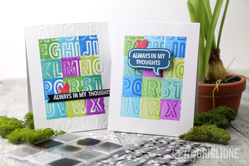
I really had fun making these! I used the solid square from Background Blocks and stamped directly on the embossed panel (the left card). Then for the card on the right, I simply stamped the block again on a plain panel! This results in a second generation background, since the ink was already used on the first card, and a first generation letter, since that ink was never reached into the valley on the first card. So I was essentially building two opposite cards at the exact same time!

Note: a MISTI was super helpful here! It also helped that the blocks are exactly 1" (thank you concord & 9th designers!!) so moving your card after stamping was really straightforward. No complicated math going on!


It was really late at night, but I just couldn't leave the craft room until I tried out some more color combinations. Cool colors, warm colors, rainbow colors, so many different possibilities!


I chose this sentiment (from You are Here) because I thought the letters represented various thoughts that would go through your head. The cute heart and the speech bubble are from Faith and Love. Really happy with how these turned out, and that I got double the amount of cards (except the warm colored card, since that was made before I thought of second generation stamping).


Well folks, that's the end of my scheduled posts for Concord & 9th, she says with a tearful eye. It was SUCH a pleasure guest designing for them in the month of March. Like their other releases, these sets are so well designed, trendy and just plain fun! A big thank you to them for inviting me to guest design, and a big thank you to you for checking it all out!

-Kelly

The products featured in this post can be found through the following affiliate links:


Background Blocks Stamp Set
Double-Cut Alphabet DiesLucky Stamp SetFill-In Phrases Stamp SetDouble-Cut BUNDLE Double-Cut Numbers Dies Faith & Love Stamp Set You Are Here Stamp Set

Thursday, March 30, 2017

Concord & 9th You Are Here

Hi Folks! You may have seen this gorgeous stamp from Concord & 9th already ... the two flowers that form a heart?! Ack! Gorgeousness! With the current coloring trend I'm sure this You Are Here set has been flying off the shelves. Let's take a look ...


 I am not a phone person. Not sure why, but talking on the phone often makes me uncomfortable. Fear of awkward pauses, not knowing how to end a call politely, not being able to focus on doing other things, those all may play into it. But unfortunately, I'm sure it leaves friends and family feeling like I'm not thinking of them, which is certainly not the case. That's why I made this card, for my husband's grandma. I think of her all the time, but sadly don't call as often as I should. She loves getting mail so I'm excited to send this off to her.

I embossed the flower/heart in white and then colored with the zig clear color brushes. Very elementary coloring, as I just got my zig watercolors, but I was excited that this was done with only one pink and one green marker.


This card is a take-off from Concord and 9th's recent Celebrations and Butterfly interactive card, where it opens from the middle by sliding the two halves of the image away from each other. 


Like this. I actually made two purple hearts. One I cut cleanly down the middle, but the one on the left (under my thumb here) I cut around the flower shape so it would overlap slightly. This avoids a gap in the middle.


No gap in the middle.


Here's what it looks like opened. You can see the overlapping half of the heart, with an arrow behind it to help the recipient figure out how to open it.  I stamped "prayers" from this set repeatedly along the bottom of the card for the sentiment.

 I know this flower/heart image from You Are Here will be a staple for me to experiment with coloring. It's attractive because, well, it's floral, but it stands out from the hundreds of other florals because it's shaped like a heart. Such a smart design! Tomorrow I've got another set to explore, and there are about ten cards that I'll be sharing. Sure hope you come back to check them out!

-Kelly

The products featured in this post can be found through the following  affiliate links.


Butterfly Card DiesYou Are Here Stamp Set Celebrations Card Dies

Monday, March 27, 2017

Concord & 9th - Shiny Objects Syndrome (SOS) Leads to a Product I Haven't Used in Fifteen Years!


Hi folks! I finally figured out what I have ... Shiny Objects Syndrome (SOS) - the tendency to get distracted by new (shiny) things. This terminology has been recently coined in the internet marketing world, but I believe it also applies directly to my crafting. If I have an idea for a card, even while I'm in the middle of making another card, I'll toss everything aside to try out the new idea. It also applies literally ... I love things that shine!

With that in mind, today's projects are all very simple, and have only two things: 1) a card-sized sentiment, and 2) SHINE.


These cards all use the wonderfully large sentiments from Concord & 9th called Fill-in Phrases. They are meant to coordinate with the Fill-in Phrases bundle that also includes patterned paper and stencils, but you can absolutely use the phrases on their own, as you will see here.

This card has the sentiment embossed in white on watercolor paper, and then washed with watercolor on top. Rainbow watercolor : ) I've added some shine to the yellow area with Pearl Ex, which you'll see in more detail on the black cards below.


This card couldn't be more easy. It's almost embarrassing to post. But, there is a lot of value in simple, strong design. Bold, scripty sentiments are so on trend now across the paper crafts arena and beyond. Embossing this sentiment in shiny gold is all you really need for an effective card. I don't normally use blues as a background, but I chose it to support the missing you sentiment.


This card was also very simple to make. I was inspired by this video from the wonderfully talented Amy Rysavy from Prarie Paper and Ink who used Perfect Pearls to bring gold shine to her project.


Instead of gold pigment ink I just used Versamark ink to stamp the sentiment. I didn't have any Perfect Pearls, but, since I recently did an exhaustive purge through my entire craft room, I recalled a box of Pearl Ex that I considered getting rid of because I had it for FIFTEEN YEARS and I'm not sure if it ever got used. Yay for using old items! Yay for them turning out to be incredibly cool! I brushed this magic powder over the stamped versamark and then ...


... simply wiped it away with a swiffer cloth, like Amy suggested. Oh my goodness, it really worked!! This is the first time I tried this, and as you can see above, I was a little heavy handed with the swiffer wipe and took some of the powder off. You don't have to scrub it! Just a light, easy, cleaning is all this needs.


I love the different colors this medium comes in. You could certainly make it all one color, but I was having fun combining them for a gradient effect.


And here's a small video showing the shine in real life. I will definitely be using these long-neglected powders more often!

I have a few more posts over the next couple days with more goodies from Concord & 9th so be sure to stop back. Thanks so much!

-Kelly

The products featured in this post can be found through the following affiliate links:


Fill-In Phrases Stamp Set

CFS Mazel Tov


Hi Folks! In just a few short days, CAS-ual Fridays will be releasing a new set of stamps! Today I'm featuring the Mazel Tov set. In addition to the focal point "Mazel Tov" sentiment, it has a lot of secondary sentiments for Jewish, and other, occasions.


It was perfect timing for me, as my 12-year-old son was just invited to his first Bar Mitzvah celebration for twin classmates. I imagine they (and/or their parents) will be quite surprised to get a custom stamped "Mazel Tov on Your Bar Mitzvah" card from their non-Jewish friend. I'm so excited to give it to them! This card is super simple using just the sentiment on a panel, which is layered on blue glitter paper.

Since the stamps were already laid out on my Misti (to get the centering just right) it was easy to make another card for his brother and one extra to have on hand ...


This sentiment is embossed in white and has a light watercolor wash on top.


Same watercolors for this card, only I upped the intensity to get a greater contrast with the white embossing. The stars in the background are from Star of David.
 

Keep checking the CAS-ual Fridays blog to see a new set each day. On the 31st everyone will get together and host a blog hop showcasing all the stamp sets from this release. The sets will also be available for purchase that day. Hooray!

Thanks for looking!
-Kelly

Monday, March 20, 2017

Concord & 9th Faith and Love


Hi Folks! I've got a TRUCK LOAD of cards to share with you using the new Concord & 9th sets Faith and Love and Lily. These sets were initially meant for Bible Journaling, but as you'll see they are perfectly at home on the front of a card. I was only supposed to create 1 or 2 cards from these sets, but I was having so much fun, loved the results, and could not leave the craft room ... for a few days, hahaha! One night I had even climbed into bed, and then hoped out a few minutes later to try out another idea. Any stamp set that has me creating from 2:00-4:00 in the morning is a winner in my book!

But enough chatting, let's get started, shall we? We've got a lot to get through today!


This is actually the card I hoped out of bed for : ) I just love all the sketchy words in Faith and Love, and how they look in the actual stamp packaging, so I wanted to replicate that on a card. I stamped the lily from Lily, and then made a mask so I could stamp all those words in the background of this one layer card.


You can see the progression of how this card came about once the lily and words were stamped. I first sponged around the lily with green, which was more to make the lily white through contrast, versus making the background green, but the words were too prominent and distracting. So I inked the entire card in blues and greens. The words were still demanding more attention than I wanted to give them, so I added some water spatters and sequins.


This card uses the same concept of stamping/coloring the lily, masking it, and inking around the mask to make it stand out. Instead of using the solid, center stamp to color in the lilies, I used my Zig Clear Color markers and flicked the brush from the center of each petal to the end. No watercoloring at all here, just the straight marker to give it a more stylized look.


Very similar card, but instead of sponging the background, I left it white and drew a border around the card. Also changed the sentiment (there are so many to choose from, you'll always have something different!)


Using only the Zig watercolor brush to color the lilies made things go a lot faster, so I ended up making a few more of these.


Here's another shot of a card coming together. I started with choosing and arranging the words for my sentiment, and thought it wasn't half-bad with just the black text on a white base. But I decided to add a background, in pink, with the fern and spatter stamps. Also not bad. Inking the edges really helped put more focus on the message. And finally ...


I inked each of the stamps in a different color, and then, with the stamps still laid out on my misti, shifted my card base to the right a touch before stamping again. This gives the text color and helps it stand out a little more. 


So in love with being able to make longer sentiments that say more than "happy birthday" or "thank you." I think it makes the card more unique, which is kind of the whole point in making your own cards. This has the feel of subway art, and is bordered with a combination of stamps, also from the Faith and Love set. You could put the flowers in all four corners, only one corner, or opposing corners like I have here. Then whatever is left you stamp with the line and plain corner stamp.


Here's another version in pink. Other stamps from this set include the dotted arrow underneath "follow" and the cute heart. The text "heart" is borrowed from the You Are Here set.


Here's what my Misti looked like. There is only one set of corners and lines, so after stamping the first time I removed all the words, turned the card panel around 180 degrees, and then stamped the corners/line in the other direction to perfectly frame the sentiment. You'll also see the were a few stamps that had to be on regular blocks, mostly because they needed to go too close to the other words. And, I was still in the process of making the previous card, so you'll see that all laid out on the Misti as well. My Misti sure got a lot of traffic that day!


Here is the set of cards, with an additional yellow/orange flowered card on the right. You would not believe, but since I had everything laid out on the Misti, I went ahead and made 9 MORE panels. Why not, right?


Changing the colors in the flowers, and the patterned paper underneath, makes it easy to give each card its own flavor. 

Wow, that was a lot of cards to get through; so happy you made it to the end! Next Monday I'll be showcasing a different set from Concord & 9th so be sure to stop back. Thanks so much!

-Kelly

The products featured in this post can be found through the following links. These are affiliate links, which simply means if you decide to make a purchase I will receive a small commission, at no additional cost to you. This helps me justify spending so much time and money on this wonderful hobby of ours to my hubby : ) 
  
Faith & Love BUNDLEFaith & Love Stamp Set Lily Stamp Set