

Hi Friends! I'm pleased to be a part of the Altenew Build-a-Flower blog hop for April, featuring the lovely layered Torch Ginger flower and die set! You may have come from the blog of Maryam Perez, but if not, feel free to start at the beginning with the Altenew Card Blog.
 |
| BAF Torch Ginger |
This month's beauty has no less than five layers, if you count the black outline (always good to keep in mind that you can use this black outline image for a Paint-a-Flower as well). For my two cards today, I'm got one layered floral with the black outline, and one layered floral without the black outline, so you can see the different looks.

For this card I was going for a retro wallpaper look. I stamped all four of the layers, except for the outline image. I'm impressed with how much dimension there is to this floral! Maybe that's why I decided to skip the dies for this one and make a whole card front with the layered florals.

Both sentiments are included in this set. To cut down on the contrast a little, I colored the negative space with a light blue.

This card is a bit different, in that I left off the fourth coloring layer (the solid color which is typically the lightest) and that I used the black outline layer. Without the fourth coloring layer, you can now see small bits of white, creating some nice highlights.
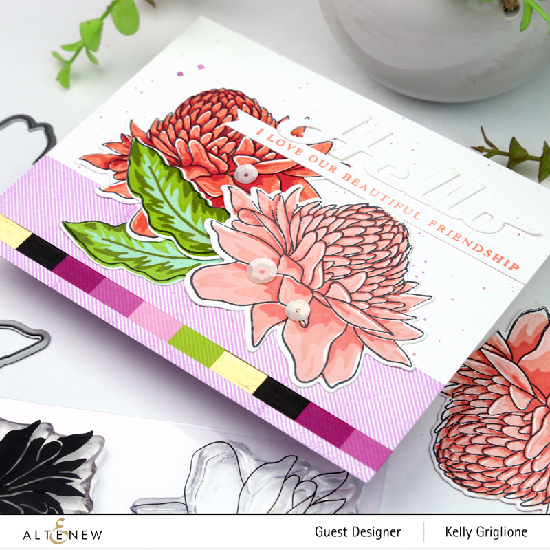
Here you can also see the leaves with all four layers. The Hello die is from the Bold Greetings Die Set, and the stamped sentiment is from Warm Hugs.

Did you notice the purple bottom of the card? At first I used the same blush color as the Torch Ginger, but I decided to branch out a little and turned to an analogous color purple. I was happy with repeatedly using one of the Tartan square stamps (the one with the thin diagonals to make the fabric texture) to make the lower border. On top of that I ran a strip of the new Sweet Pea Palette washi tape to finish it off.

The Torch Ginger is quite a substantial flower with a ton of details. One thing I should also add is a tip for lining up the layers .... I always stamp the DARKEST layer first. That way when you stamp the next layer, the darker layer on your paper is easier to see through the next stamp.
Prizes:
To celebrate this release, Altenew is giving away a $30 gift certificate to 5 lucky winners! Please leave a comment on the Altenew Card Blog for a chance to win. We'll also draw a winner to receive a $15 gift certificate from comments left on each designer's blog in the blog hop. All winners will be announced on the Altenew Blog on 4/9/2020.
I'm pleased to send you to the next stop on this blog hop, the very talented Nicole Watt!
Thanks for stopping by!
-Kelly
Supplies Used (Click on the affiliate link images to purchase, thanks so much for your support of my blog!)
 |
| BAF Torch Ginger |
 |
| Sweet Pea Palette Washi Tape |
 |
| Tartan Stamp Set |
 |
| Warm Hugs |
 |
| Bold Greetings Die Set |
ReplyDeleteThanks for the tip about using the dark layer first. That makes it a lot easier to line up!
Two beauties, Kelly ... gorgeous wallpaper background ... and a lovely floral arrangement over the slender diagonal stripes ... a fabulous showcase! Hugs, Anita :)
ReplyDeleteYour hello card is fantastic! I can't wait yo get this set
ReplyDeleteFabulous cards. I like the first one without the outline layer...it has so much depth to it. The second card is fantastic with the usage of the square from the tartan stamp set.
ReplyDeletestamping sue
http://stampingsueinconnecticut.blogspot.com/
Lovely cards! The Torch Flower is gorgeous, so bold and versatile. Thanks for the layering tip...I know it will help me!
ReplyDeleteThese are both beautiful and I would be hard pressed to choose a favorite since I love both looks!
ReplyDeleteSuch a beautiful torch ginger. What a treat for the eyes.
ReplyDeleteBeautiful cards!
ReplyDeleteLovely cards using this fabulously unique flower.
ReplyDeleteLove your cards!
ReplyDeleteYour tip for stamping the darker layer first is so true! I have done this for years. And, I love both of your beautiful cards Kelly!
ReplyDeleteBeautiful cards! I wouldn't want to give them away!
ReplyDeleteBeautiful cards and a great tip! Thank you
ReplyDeleteGorgeous new stamp set. I love the vintage feel of your first card and that it's versatile enough to make a more modern card too!
ReplyDeleteI love this new set. Your interpretation of it is awesome. I love both cards.
ReplyDeleteWonderful cards. Really like your ink choices!!! Thank you for sharing!
ReplyDeleteIt’s amazing all the art you can creat with one stamp set. I really love the aesthetic you create with these cards.
ReplyDeleteLove the different ways you used the stamp and the colors. Lovely!
ReplyDeleteWhat pretty cards! Both are stunning. I especially like your flower colors and the card layout.
ReplyDeleteWhat nice colors you chose. These are so simple to make, and pretty...
ReplyDeleteI like the comparison of the layers with different borders.
ReplyDeleteVery beautiful, thanks for the layering tip. I have a hard time figuring it out sometimes.
ReplyDeleteThese are stunning! What beautiful colors!! Thank you for sharing.
ReplyDeleteBeautiful work, love the colours on the flowers. Tfs x
ReplyDeleteGorgeous cards!! I love using the Tartan stamp on the bottom of the card.
ReplyDeleteWonderful cards Kelly!
ReplyDeleteBeautiful cards, I love both with and without the outline. I LOVE the purple Tartan Squares and washi tape, so fun and great pop of another color. Thanks for the tip on layering - I haven't tried stamping the darkest layer first!
ReplyDeleteThese are stunning! I LOVE the one you did making them the background! GORGEOUS!
ReplyDeleteSuch warm and beautiful cards!! Inspires me to make some of my own!
ReplyDeleteBoth cards are stunning, in their own way! I really love the look without the line. Beautiful! Thank you for your tips
ReplyDeleteBoth cards are stunning, they are amazing!
ReplyDeleteBoth cards are beautiful. My favorite is the first card without the black lines.
ReplyDeleteBeautiful, Kelly! I'm especially drawn to the second one with the Washi & 2 shades of flowers! Thinking of you & hoping you're all doing well.
ReplyDeleteNicely done!
ReplyDeleteLove your retro wallpaper look! I have always loved large floral wall paper designs and your design would have been a great one!
ReplyDeleteBeautiful cards. My favorite is
ReplyDeletethe one with two different colors.
Thanks for sharing
txmlhl(at)yahoo(dot)com
Beautiful cards - the one without black outline is my favorite. Great tip to stamp darkest layer first.
ReplyDeleteThese are both stunning!
ReplyDeleteHi from Farmington, NH. Very pretty cards!
ReplyDeleteHi from Wisconsin. Love the color . Very nice cards too. TFS
ReplyDeleteLOVE those colors. Beautiful cards ♥
ReplyDeleteLovely details with these beautiful flowers! Love your awesome cards and the colors you used!
ReplyDeleteLovely card designs Kelly! Love this new BAF set, thanks for the inspiration!
ReplyDeleteI can definitely see the wallpaper look, Kelly. The colors you chose for that flower are gorgeous. That is one thing I love about the build-a-flower is that you can use the outline stamp either way-with the layers or to watercolor. Great idea to use the tartan stripes for your border on the second card. I can see it looking like blue denim.
ReplyDeleteBoth of your cards are just gorgeous! Love Altenew floral stamps!
ReplyDeleteI especially love the first card, tho the 2nd one is also beautiful, as I am a complete sucker for the wallpaper look (and for wallpaper in general). Nice work. Also, thank you for the alignment tip!
ReplyDeleteI stopped getting the BAF stamps for awhile because I just had so many. This one is in my cart right now, though! It is unique, and big and bold, and I love what everyone has done with it in this hop! Thanks for adding your inspiration to all the others....the washi tape was an added bonus today!
ReplyDeleteGorgeous cards. I really love the almost monochromatic look of the first card.
ReplyDeleteHowdy. I found you through Altenew's page to see how you've used their Build-a-Flower: Torch Ginger stamp set. Very nice.
ReplyDeleteSuch lovely cards! Stunning and creative designs with such beautiful color combinations.
ReplyDeleteThis floral set is beautiful! I love the one where you skipped the fifth layer and instead used the lined stamp.
ReplyDeleteLove the use of the washi tape. Just kind of takes it to another level.
ReplyDeleteGorgeous cards! Love the depth you got on those flowers.
ReplyDeleteBeautiful flowers! That tip is the best ever, yuppers really makes it so much easier. Thanks for the inspiration and please stay safe and healthy!
ReplyDeleteWonderful cards!!
ReplyDeleteYou really did achieve a wallpaper-like card design. I love it!
ReplyDeleteWow - beautiful. I love that first card with the gorgeous red blooms on that soft blue background. It does look like a bold, lush floral wallpaper.
ReplyDeleteBeautiful cards! I think I like the flower without the outline. Looks more natural.
ReplyDeleteYour cards are both so beautiful! :) The first one is my favorite
ReplyDeleteBeautiful cards. Thanks for showing both with and without the black outline.
ReplyDeleteOoh these are so beautiful! The first one is my fav! <3
ReplyDeleteOooo . . . these are so gorgeous!! I LOVE the coral colors you used!
ReplyDeleteI love both cards with and without the outline image, thanks for showing us both and for the great tip! Your cards are amazing!
ReplyDeleteSo pretty!! Thanks for the great tips.
ReplyDeleteThese are both lovely. My favorite is the first one. I think that without the outline it had a more realistic and softer look. Those flowers look beautiful against the blue. I really like that washi in the second. It brings everything together.
ReplyDeleteBeautiful work, love the flowers are how simple they are to layer.
ReplyDeleteThese are stunning!
ReplyDeleteBeautiful color choices!
ReplyDelete