Friday, September 6, 2013

Fusion #17 - An Alternatve to Inktense?


For this week's Fusion Challenge I managed to incorporate both the photo and the sketch. What a great photo, too, so many possibilities in that one!


A little cheeky, so definitely for one of my closer friends! The DPs are a recent purchase from the Scrapbook Expo that I got to hang out at with my crafting partner-in-crime (she even lives behind me, how dangerous is that?!?)


 We took a SEI class, and bought lots of discounted paper!!


Another recent purchase has been the Reeves Water Soluble Wax Pastels. Does anyone use these? I wanted to by some Inktense blocks, but after standing in the aisle looking at its $39.99 price tag, and the $13.99 price tag for the wax pastels, I got the cheaper ones instead. 


They seem to work pretty well so far. Great coverage and really intense colors. I have to think there's a reason they are so much cheaper though. 

Anyway, please stop by the rest of the fabulous Fusion Challenge designers, and hope to see you in the gallery! Remember, it's still a 2 week challenge, so you have plenty of time to cook up something fun!


Thanks for looking!
-Kelly

CFC114 - Ride On, Little Man + pics


Even if you don't have any "school" stamps, this is still a fun challenge to tackle at CAS-ual Fridays. Think math, primary colors, notebook paper, inspirational quotes, anything related to school or learning. Our sponsor is Ellen Hutson, and the winner of this 2 week challenge will receive a $25 gift certificate for whatever awesome new products you've had your eye on!


This one is for my 4th grader, who's been getting frustrated as the work has become more difficult over the years. My sentiment is that even when you feel you've speeding down the road on two wheels, hang in there and "ride on" until all four wheels are back down. I'm sure there's a more eloquent way to say that : )

paper - Indie Chick, My Mind's Eye
washi - Ruler, Studio Calico
stamp - The Paper Company
font - Courier New
sequin stars

Thanks for looking!
-Kelly

PS. Here are some back-to-school pictures. Hard to believe they've been back for two weeks already!


Only picture of the 4th grader ... he darted off to the bus stop right away.


The Kindergartener was much better with tolerating the photos.


I got the range of emotions, from super-excited ...


to perhaps a little bit of uncertainty (which is unusual for him). 


Grandma even came for the day!


Monday, September 2, 2013

Snowman Snow Globe


After seeing all those things-under-glass-turned-snow-globe projects that were so popular in magazines and Pinterest last year, I thought I'd try my hand at making one for the Moxie Fab World Holiday Decor Challenge.


The large bubble label die makes an easy snowman when you cut off the bottom portion (check out Dana's fun snowman too!) This guy is a layer of chipboard* sandwiched with felt on each side so he's pretty sturdy. In between the felt layers I glued branches from a Memory Box die for the arms. His scarf is from a vintage (1970's) piece of material.

*actually it's a piece of a fast food drink holder box painted white to match the felt


For the bottom I was picturing some wispy cotton with that big, chunky, vintage glitter. However, 1) I couldn't find the cotton; and 2) I couldn't find the big, chunky, vintage glitter. When I unpack the Christmas boxes it will appear. So for now, I have the bottom as a balled up Kleenex, covered in batting, with some wimpy glitter that would not shake too well sprinkled on top. It's a place-holder.

The snowman is able to sit on the hill because I left an end of the middle chipboard layer extend beyond the snowman die cut. That extension is slid through a slit cut in the batting. Then I split that extension in two and spread it out underneath the batting to allow the snowman to stand.

The lid of my snow globe, which in a previous life was a salsa jar, is spray painted in silver and screwed back onto the glass. A bow I saved from a present last year finishes it all off. Love making projects from scraps around the house!

Thanks so much for looking!
-Kelly

Friday, August 30, 2013

CAS-ual Fridays #113 - Krafty Text


I channeled my inner Donna Mikasa for the latest CAS-ual Fridays Challenge to use type and kraft paper, and went for neon on kraft. I've been dying to try it, she always makes it look so. darn. good.


For the background I was also excited to emboss with the spray mist templates. I still can't get over how fun this is! I would seriously buy this design as an embossing folder. I like how it gives more energy for the "screaming and shouting" but still keeps the card kinda clean (I know I am not always the best at being on the clean side of CAS).

Fonts are Ariel and Impact, cut on the Silhouette. Ampersand is from PTI Block die set.

(side note, lest you think "well that's not a very involved card, she just typed it and cut it out" let me tell you that was not the case! Wrestling with an old cutting mat which needs washi tape to sufficiently hold the paper down, which needs MANY pieces of tape, a dull cutting blade, an even duller back-up blade, figuring out that's what was wrong with my machine, going to M's for a new blade, and starting all over again definitely took the better part of the afternoon and evening.)

Please go check out the others in the CAS-ual Fridays gallery, and say a fond farewell to Pamela and AJ who are leaving this term. It was wonderful to work with both of you talented ladies!! The winner will receive a wonderful prize from our sponsor CAS-ual Fridays Stamps!

------------

Since I made a double set of the Will.i.am and Britney Spears song lyrics in case of any mistakes (does anyone else do that?) I thought it was the perfect opportunity to finally play in a challenge again. This may be the first challenge I've done all summer!


How can you pass this ombre beauty up at Moxie Fab's Tuesday Trigger?


This one's a little more clean. I started with a white base, but after putting the letters on charcoal and seeing how they popped so much more, I changed directions. The grey and white stripe on the side is directly from Maria's wonderfully CAS glittery peace card.

A note of caution for those who haven't made a card featuring song lyrics before, make sure to pick a song you really love. You really can't piece the text on to your card without the song going through your head on an endless loop. Double caution if the card takes way longer than expected. And guess what? You also sing it while writing your blog post!

Thanks so much for looking!
-Kelly

Friday, August 23, 2013

Fusion #16 + Get More From Your Tools!


Can't wait to show you what I ran through the embossing machine this week! Last week I ran burlap through and was quite excited at the resulting texture. This time I ran the plastic mister templates through ...
  

 Folks, that works too! This is the Studio Calico Chevron Mister Huey Mask, meant for masking with the mist sprays. But, it works WONDERFULLY as an embossing tool. I put a few shims through to make the impression a little deeper. You just have to play with it.

For this card, I used the Studio Calico Circle Graph Mister Huey Mask.


It's inspired by the luscious summer colors in the Fusion Card Challenge photo.
  

I ran the Studio Calico Circle Graph template through the Big Shot and came up with these wonderful impressions. Oh the possibilities! I cut out random sections of the circle graph and put them together on the main card.

I wanted it to go with the saying. All the days (the bars) adding up to the knowledge you acquire over a year (the circle).  
 
Woah, getting a little deep here! : )


Anyway, I was excited with how this one turned out, and can see playing with this technique more in the future. Please stop by the rest of the fabulous Fusion designers, and hope to see you in the gallery!


Thanks for looking!
-Kelly

CAS-ual Fridays Stamps: Some Fun Ones!


It's my day at CAS-ual Fridays Stamps to have a little fun with some cards!

(eta: you might notice that these cards look NOTHING LIKE the actual cards on the CAS-ual Fridays Stamps blog ... sorry about that!)


This one may not look like much, but MAN did I spend a lot of time on it. The red/white/blue background was the really tough part. I lined up 7 of the Big Thanks sentiments on an acrylic block and stamped/embossed them down a strip of red paper. Did the same thing on white and blue paper.


Now comes the part where you tear your hair out and stamp 20 more strips of paper until you get it right (OK, that's an exaggeration, but it took a LOT of tries). I sliced them each in thirds and then put them back together again so the words would read across.

The trouble spots here are making sure you stamp the words in the exact same spot (vertically AND horizontally) all the way down the strip, and making sure you cut the strip exactly in thirds.

Not sure how quickly I'll be doing this technique again.


This one uses a background from Zigs & Zags as the focus. A mask is used for the shading on the bottom. For the top row, I flipped the border stamp upside down to make the diamonds, and colored in the resulting tiny squares.

The sentiments are from Truth Is and Frankly.


This one, quite honestly, is one of my favs. It was submitted for a publication call for sympathy cards without using a sympathy sentiment. Can you guess what material the flowers are from?


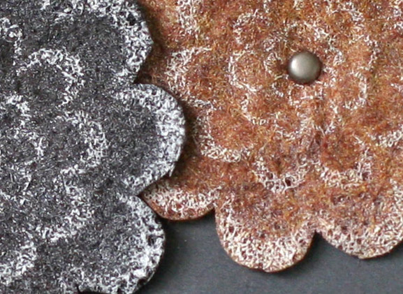
They're felt, only heat embossed. You really need to try this if you haven't already! Heating the felt makes it shrink up and bubble a little, which is the perfect shape for dimension on a flower. The density also makes for a sturdier embellishment, so it would be good on its own, like for a tag, ornament, etc.

The flowers are from Loving Thoughts and the sentiment is one of the many frequently-used phrases from Calm & Gentle. The border is a white gel pen.

Thanks so much for looking!
-Kelly

Friday, August 16, 2013

CFC 112 - Aqua, Green and Orange + A Story


It's a color challenge this time at CAS-ual Fridays! Feel free to use whatever shade of these three colors you'd like. There are so many possibilities! 


Today's sponsor is Simon Says Stamp, who will kindly have a gift certificate waiting for the winner of this challenge.


I've been wanting to use some of the sentiments from Stampin' Up's Word Play set, and the one with the world is perfect for aqua and green. Glossy Accents on the world gives it a little needed interest since this is a really simple card. The orange is from a mat stack die that I cut the rounded tops and bottoms off.


Then I decided it was a little too simple, so I added some more stuff on the bottom of the card. I prefer it this way, I think.

 Be sure to stop by CAS-ual Fridays to check out the Design Team inspiration, and to link up your vision of Aqua/Green/Orange!

------------

Recently I was contacted by a young mother who was diagnosed with mesothelioma. As a girl, she loved to wear her dad's coat. Unfortunately, her dad was a construction worker who unknowingly came home covered in asbestos every day. I know, heartbreaking, right?!

If you have a few minutes, I would love for you to hear her story. Her goal in reaching out is to help raise awareness, and provide a sense of hope to others. Thank you!


----------

Thanks for looking!
-Kelly