Friday, June 28, 2013

Fusion #13

(Please scroll down for my CFC post earlier today)


For anyone who's been holding out on the Fusion Challenge, now is the perfect time to play! You've got a whole month (yep, a MONTH) to come up with your take on the sketch, the photo, and/or a fusion of both. This challenge stays open until July 23rd. 


For my take on the sketch, I replicated the objects at the top of the panel, the banner on each side of the panel, and the sentiment on the panel. The sentiment needed a little more pizazz after I stamped it in orange, so I highlighted the secondary sentiment with a yellow marker. If you look closely at the embossed strip, you may notice that it's actually two designs. I did the stripes first, didn't like it because it was too similar to the candles, and then embossed the sunshine impressions over it. Definitely not intended, but I like the look.

Thanks for looking!
-Kelly

CFC #107 - Hunger Games


 Hi friends! We've got a trendy challenge at CAS-ual Fridays this week ... you must use arrows on your Clean and Simple project. Fun!! Our sponsor is the fabulous Simon Says Stamp who will award the lucky (well, really, talented) winner with a mighty fine prize.


I kinda really like this one. Here are the highlights:

1) made an arrow with a sentiment from Rad
2) gave it more definition by running the wide end of a marker along the arrow
3) made a pizza shape at the end of the arrow with the three "e's" lined up
4) broke up the remaining sentiments, and intentionally left some ink on neighboring letters in "awesome"; also intentionally made the "me" bleed off the bottom edge
5) thought the card needed more, so filled in the stars and drums with a light marker
6) still thought it needed more, so stamped the dots from Only You in overlapping green, mimicking the arrow shape
7) just a little more, used a green texture stamp in the bottom corner (not mounted on a block, just used the clear stamp with my fingers so there were no hard edges)
8) one last touch (crossing fingers that it doesn't ruin everything), a Tim Holtz distresser for the edges of the panel.

OK, done! If you haven't already, check out all the other arrow samples from the awesome Design Team. I can't wait to check out the gallery!

Thanks so much for looking!
-Kelly

Tuesday, June 25, 2013

Papertrey June Blog Hop - Golden Ticket


 Hi friends! Here's a quick one for the Papertrey Blog Hop featuring a touch of gold. I just discovered gold embossing on gold foil paper and I love it! Gives a real nice engraved look. I made a trophy card for Dad's Day with this technique that I'll have to post some day.


It's a golden ticket. Unfortunately this one is only good for a special birthday wish, and not a magical train ride to the North Pole.

(ETA: OK, so you all know my secret now ... I have never seen Charlie and the Chocolate Factory!)


Just the Ticket is used for the golden ticket and the tickets piled underneath (works as my foam tape and additional texture). A mat stack is used for the screen material, which worked out really well since it gives a matted area, but you can still see the background through it. The background is embossed on silver on a matte silver cardstock.

I'm happy to add this to my masculine card pile. 

Thanks for looking, and happy hopping!
-Kelly

Monday, June 24, 2013

Boston Strong and Autumn Leaves


Hi folks! I've got two more cards from the recent CAS-ual Fridays Stamps release. They both feature, in a more non-traditional way, the first border stamp on the left from the Lotsa Links set.


A subway map. Why not, right?! I have to admit that I'm not exactly sure what occasion I'm going to use this card for, but I got it in my head that the smaller links looked like stops on a subway map, and I wanted to see what it would look like. So I picked Boston, since we got to know the subway a little during a prior vacation. I added the stops in small, messy letters, so there wouldn't be a ton of focus trying to read them all. I just wanted the general idea that they are subway stops.


It's so fun getting all your stamps out and playing with them. While doing this for the release projects, I was so excited to find out two things:

1) the tiny trio of four-squares from Only You exactly fills the middle of the small square links; and
2) the keys from Tech Talk fills the middle of the large square links.

I started by making a tree shape, with the large squares for the trunk, and the small squares for the branches. Then filled the branches to make the leaves, and filled the trunk with the asterisk key (it was the most generic one). Shading in the tree branches helped it look a little less stark. The sentiment is also from Only You, except the ampersand which is from an old PSX wooden alpha set.


Thanks so much for looking!
-Kelly

Friday, June 21, 2013

Fusion #12

(this is my second post of the day, for CFC please click here or scroll down)

Here's the 12th Fusion challenge sketch and photo ... I will admit I'm a little jealous I didn't get to play with the photo this week! But as it turns out the colors are a little similar. Here is my sketch-based card:


The stripes are from the actual sentiment (lightest on top to correspond with the thinnest stripe in the sketch). Three elements overlap the stripes. The background got a tiny bit of pizzazz with a boom box image from the set stamped in watermark ink. 


The girlie skull and crossbones are popped up on a double layer of mounting tape, with the star and heart on a single layer.


All stamps are from Love, Elsie. 

Please check out the FUSION challenge for more inspiration from the Design Team, to enter your own card based on the sketch and/or photo, and later in the week to vote for your favorite entry.

Thanks so much for looking!
-Kelly

CFC #106 - Off the Edge


Another fun topic this week at the CAS-ual Fridays Challenge ... lots of possibilities with this one! We're focusing on CAS projects with an element or panel that goes off the edge. And the sponsor is none other than CAS-ual Fridays Stamps


My first idea was to just have the cluster of enthusiastic words stamped off the bottom edge. But then I thought it might have been cheating a little that my element going off the edge was the invisible end of the letters. So I used my exacto blade to cut around the "S" and "L" on the right edge.

The cluster is made up of sentiments from Brickworks and Exclamations.

If you haven't already, consider heading over to CAS-ual Fridays to see the other wonderful inspiration from the Design Team, and/or to update your own card for the chance to win.

Thanks so much for looking!
-Kelly

Wednesday, June 19, 2013

CAS-ual Friday June Sneak Peak

Hi all!
 
First of all, a huge thank you to everyone for your incredibly kind comments earlier this week on the Moxie Fab Feature! It was truly overwhelming, and I'm left feeling even more thankful than ever to be a part of this awesome community of supportive paper crafters. 
 
 
 Today we're featuring cards made with one of the neat, new border sets from the June stamp release at CAS-ual Fridays Stamps. It's called Lotsa Links. Fun!


First up, a baby card using the intersections of the links for the sentiment. After stressing about what alpha set to use that would fit the blocks well, it dawned on me to just use my pen and write it. Sometimes, the best solutions are the most simple, right?!

I picked light primary colors so the color mixing for green/orange/purple would be more noticeable. Then just used an exacto to cut out the cross they made. 


Here's a one-layer card that uses two more of the link borders. The larger square border was the perfect size to house the square keys from Tech Talk, so I split up the letters by selectively inking them (I still can't cut my stamps. I'm getting closer to doing it though!) and stamping "sorry" in the spaces. 

Then I made a mask of the large square links and sponged purple below, and stamped the tiny oval links above. To get the striped look I carefully stamped a second time over every other row. Not gonna lie, that was a little stressful for me! Next time I'll just use generational stamping I think. 


This card uses all three sizes of the oval links border. Since they are separate, you can mix and match the sizes and colors to your heart's content. I went with the appearance of thick stripes by stamping several together in the same color.

The numeric 8 in the focal point was made by selectively inking the end of the oval link and stamping it as the top and bottom of the 8. The word "eight" comes from the Countdown set. 

Be sure to visit the CAS-ual Fridays store on Thursday, the 20th for the full reveal and shopping! Also stay tuned for early next week when I'll post two more cards that use this stamp set in completely different ways.

Thanks so much for looking!
-Kelly

Monday, June 17, 2013

Nuts for Moxie Fab World!

 Hi everyone! Hope you were able to celebrate Father's Day with the special Dads in your life this weekend!


I'm so excited to be a part of the Moxie Fab World today as Moxie Fabber of the Week! What a huge thrill. If you get a chance, check it out!


I'm sharing these Nuts 4 You Squirrels that appeared in the 350 Cards and Gifts Paper Crafts special issue as my way of saying,

"I'm nuts 4 Moxie Fab World!"


The squirrels were originally made for a card exchange, and came from the Noah's ABC Animals Cricut cartridge. Fun to mix all the different patterns together. And bonus that they easily fold flat to slip into an envelope.


I also thought they'd look cute as a gift topper, since they're 3D and sit nicely on their own.

Thanks again, Cath, for your very kind words today. You're the utmost in Moxie Fabulousness!

Thanks so much for stopping by!
-Kelly

Friday, June 14, 2013

Fusion #11

please click here for my CFC#105 post, or scroll down, as this is my second post of the day.


 Who's up for a fun challenge at FUSION this week? I see Father's Day written all over the inspiration photo : ) But since I'm on Jackie's challenge team using the sketch only, I'm foregoing the Father's Day theme ...


and going with the fun Mixy and Matchy theme at Moxie Fab World. A very liberal interpretation of the sketch for me, but I'm fine with that. I'm always of the opinion that a sketch should inspire you, not necessarily constrain you. So I stamped four different patterns with colors I would never pick together. In hindsight, I think this would have been more dramatic with different patterned papers so everything wouldn't be so white-based like it is with stamping. But it was a fun experiment! There's one spot where the houndstooth overlapped a little, and one spot where the zig zags didn't line up, but I decided to leave that and go with the fun, loose theme (branching out for me here!)


While I was mixing and matching, I saw a bunch of Halloween ribbon that would be fun to mix. And then I threw in two that definitely weren't Halloween. Mr. Bones' candy bag worked out as a good place for the sentiment.

ETA: I'd like to say that this card is based on the photo inspiration, as Ardyth kindly pointed out, but I wasn't that thoughtful. Maybe subconsciously?!?

Thanks so much for looking, and hope to see you in the gallery!
-Kelly

CFC#105 - Travel Theme


Ready for another fun CAS-ual Fridays Challenge?! This week we're on the go with a travel-themed challenge. Sky's the limit, whether you'll be taking to them or not for summer vacation. 


The lucky winner will get a stamp set of their choice from CAS-ual Fridays, where a new release will be debuting next week! Don't forget to check back and see what goodies are available!


When it comes to cards outside the typical Happy Birthday/Thank You/Congrats/Sympathy sentiment, I'm often at a loss because honestly I have trouble keeping up with all of those occasions let alone finding new reasons to send a card. But it finally occurred to me that I could send a card to my traveling partner-in-crime as we start Season #4 of our City Adventures with the kids.

--------- side note on our City Adventures --------

It started with me being frustrated always taking the interstate right into The Loop and wondering what we were passing by. So I selected a guide book from the library (have since bought it ... Walking Chicago: 31 Neighborhood Tours) and each summer we pick different walking tours to take with the kids. It's really amazing how diverse our adventures have been all within one city. We've hung out in Cuban delis with old-timers giving us parenting advice, Chinese apothecary shops with hundred dollar/pound sea creatures lined up on shelves and a shopkeeper keeping close watch on our kids, African-American beaches where it couldn't be easier to track my blond haired boys in the water, walked past the diner where Al Capone used to hang out, been out waaaay too late in Humboldt Park where you don't want to be after dark and realized that the sausage truck we parked by is just one of a dozen identical sausage trucks, strolled into fancy boutiques on Oak St with our swim attire still on from Oak St Beach (big no-no), walked by Obama's Chicago house, Jessie Jackson's Operation Push Headquarters, Louis Farrakhan's Nation of Islam Mosque (couldn't get in much as we tried), I could just go on and on and on. Then we always end at a beach. We've tried a lot of them. I could go on about those too!

---------- OK, back to the card! ---------


So of course, the "Chicago" has to be highlighted in this stamp of favorite destinations. With all white letters in the red heart layered over the background, it still looked a little busy, so I went over the other cities in the heart with a red alcohol marker. This makes "Chicago" the main focus.

Then the "Hello adventure" sentiment is a Papertrey die cut from a huge roll of wall paper that my mom found for free at a garage sale, with a Heidi Swapp stamp in bronze.

Thanks for sticking with my very wordy post this week!
-Kelly

Friday, June 7, 2013

Fusion Challenge #10

(note: for my CAS-ual Fridays post, please scroll down or click here)


Another Fusion winner this week! How interesting. One of these weeks I predict there will be a sketch or photo-based winner, right? Wait, I was wrong, it WAS a PHOTO winner this week!! Leave it to Debby Hughes, such a fun card!


For my sketch-based challenge, I rotated the sketch and placed several elements (numbers) along the strip. For the stripes on the end of the sketch, I used an exacto to cut 2" slits in the panel so I could weave the strip through. I kinda like that element, and have it in my head to explore further on another card. 

If you haven't already, head on over to the FUSION blog to check out the other inspiration and to link up your own sketch, photo, or fusion-based card.

Thanks for looking!
-Kelly

CFC #104 - Use Banners or Flags


This week's CAS-ual Fridays challenge is to use banners or flags on your project. I love using banners, and am looking forward to seeing some new ways of using them in the gallery this week. Our sponsor this week is Ellen Hutson, so you know there is a fabulous prize waiting for the winner!


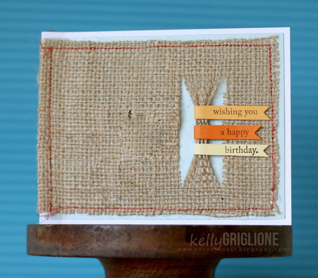
Personally, I was very happy to have a reason to use these banners that have been on my desk, in my drawer, in my shoe box lid, basically moved all around my craft room from a project that didn't work out last year. Now they have found a home and a purpose! I cut two vertical lines through the burlap panel and then removed the loose horizontal fibers. The banners wrapped around the remaining fibers, and that was that. 


I ended up using a book binding format on the card by scoring 1/2" from the left side, sticking an orange paper inside, and sewing down the margin. Just for something a little different. 

Sure hope you'll stop by CAS-ual Fridays to check out the inspiration from the amazing design team, and to link up your own wonderful creation!

Thanks so much for looking!
-Kelly

Wednesday, June 5, 2013

CARDS Blog Hop


Welcome! CAS-ual Fridays Stamps is sponsoring this month's CARDS challenge, and the Girl Friday Ink Squad all have cards based on the same sketch:


I took this opportunity to remake this card where I used the flower dies as explosions behind the bombs. I liked the idea, but was never completely pleased with how it turned out (do you have those kinds of cards that stay in your head until they're "fixed" too?) Later I realized it was because they still kinda looked like a bouquet of  flowers, just in explosion colors.
 

So this one has a few changes: 1) only 2 layers in the explosion, 2) random petals removed, and 3) random petals shortened. I think this helps to make the explosions look a little more realistic.

This card uses the Ka-Boom and Brickworks sets from CAS-ual Fridays.


Be sure to leave a comment on each of the blogs as you hop along.
One of the blogs...and it's still a mystery as to which one it will be...will have a random winner who will receive a really great prize!
If you got lost or sidetracked along the way, here is the lineup:
Kelly Griglione <--you are here
 
The prize for the sketch challenge is really awesome but you'll have to make it through to the CARDS blog to see it! Be sure to follow the instructions to include your project for your chance to win. You have until June 17th to play along.

Next on the hop is Dana ... it's no surprise that you're going to love what she has for you!  

Thanks so much for looking!
-Kelly