Thursday, January 31, 2013

Valentine's Day Mini with a Surprise


Here's a matchbox-sized Valentine's Day mini with a colored Mehndi Medallion on the cover. Love that set from Papertrey. Such a value for only $5. You could color this a million different ways and get a new look each time.

This mini has a mini surprise on the inside: 


A fun honeycomb with a greeting stuck in the layer. There are actually two halves here (top and bottom) put together to make a ball. Do you recognize where they came from? They are left-overs from the exploding ornaments I made in December. The black, inside cover is embossed with the Mehndi plate.


 Keep opening it and you've got a free-standing ball. Do you see the white thing on the left edge of the book? That's a wire I attached between the front and inside cover, wound in a circle, and used to hold the book open. You swing it one way to let the book close, then back down to hold it open. They used this idea in the 1900's to hold the fancy honeycomb valentines open. I'd like to share photos of the ones from my collection one day. You'd love 'em!


I was particularly excited at how this one turned out, especially since it used up scraps sitting on my table, so I showed it to my husband. He suggested I make a globe. Umm, right. 


 To put it away, unhinge the wire, fold closed, and slide the black band back on. Since I stamped the Mehndi Medallion off the edge, the spine of the book has interest too. I added a heard to the end of the band. Notice the white space on the fold line just above the band? Arrgh, I need to stop folding things before I stamp them! It's so much more difficult to get the ink in the cracks. I just get anxious to see what they're going to look like.
 
This mini is for the CAS-ual Fridays challenge to use markers on your card (sponsored by Spectrum Noir Markers, which I use)


and the Moxie Fab Challenge to make an itty bitty card.

Thanks for looking!
-Kelly

Tuesday, January 29, 2013

A Study in: Boxes (Cityscape)


One more box card, this time it's loosely based on the city of Chicago skyline


 and the oh-so-fun moving card by Amber Kemp-Gerstel guesting at CASE Study this week.


Taking the concept of using the heart to mark where you're going, this card is meant to send love to someone living in ... you guessed it ... the city. I was fortunate to find the word "love" in the book page on the tallest building (the Sears Willis Tower) so that's where I put the heart. What luck!

I chose book paper because I thought the letters could pass for tiny windows on the skyscrapers, in an abstract sort of way. Experimenting with building tops, I made the pointed one on the left, but kept the flaps loose so it could fold flat. Later I figured out I could make the Sears Willis tower by putting narrower boxes inside the wider ones. It didn't dawn on me to use the inside space of the box until now. Rats.


Here's a better view of the dimension. There is a second-layer building at the very left end. The background uses Lawn Fawn Interlocking Backdrops ... the mini hexies are layered on the tweed. Sentiment is from Lawn Fawn You've Got Mail.


Like the other recent cards in this unofficial 3D box card series (tiles, bee hexies, notebook paper, antique bottles, charts, and Mehndi lantern), the card folds flat for mailing and storage.

Well I think this is the end of the box cards, at least for now. I know, you all can breathe a sigh of relief! Time to move on to something new. Thanks so much for your comments : )

Thanks for looking!
-Kelly

Sunday, January 27, 2013

Inspired by Family Magazine Guest Post


Hi everyone! I'm thrilled to share some exciting news, but I'm going to have to sit on it for a little while longer. Yikes, how do people do this?! In the meantime, I'd like to share the post I wrote at Inspired by Family Magazine (about cards, of course!) I'd love it if you stopped by to check out the results. One card is made with just markers and a hole punch.


Another is a fun folk-art heart made with mirror image die cutting.


And one more with a mask from the first card.

Hope to see you there!

Thanks for looking!
-Kelly

Friday, January 25, 2013

A Study in: Boxes (Mehndi Lantern)


Here's one more for the Papertrey Blog Hop


It's also inspired by the incredible sheer dress will all those fantastic circles featured in Runway Inspired Challenge and the Moxie Fab challenge to "incorporate a window in an innovative way".

If you've been reading my blog the past couple days, you know I'm currently quite obsessed with folding boxes big and small, and how they can work in a card setting. For the blog hop, I had two ideas, the first was to make a 3D chart, and the second was to make a box with windows.


Mat Stack I is used to cut windows on each side. Hanging in the windows are vellum circles strung on invisible fishing line. The top lid is the Mehndi Medallion embossed in white and colored with alcohol markers.


Opening the lid shows the greeting on this "card."


Like the other recent cards in this unofficial 3D box card series (tiles, bee hexies, notebook paper, antique bottles, and charts), the card folds flat for mailing and storage.

Thanks for stopping by!
-Kelly 

A Study in: Boxes (Off the Charts)


So hard to believe the last Papertrey Blog Hop was Christmas ... with the Valentine's decorations up it seems like forever ago. This month the focus is on playing with color layered on black backgrounds. Fun!


Today's card is also inspired by this CASE Study inspiration card by Amber Kemp-Gerstel. I like how she used the heart to indicate where something is, so I've done the same on my card.


The hearts coming out of the embossed pink line all point to where the recipient is ... off the charts! This can be a Valentine's Day card, Birthday card, or just a Congratulations card (I'd take the hearts out in that case). Although the hearts are very tall, once they are folded down the card dimensions are the same as a standard-sized card. So, it fits in an envelope just fine.


The graph lines on this 3D card are all folded boxes, stamped with Lovely Layers in VersaMark, and cut to different lengths. Each line has an alpha label on the white axis, standing for random people, and then the "u" line in pink is the one off the charts. I'm hoping it's clear enough ... it was in my head anyway : ) 


The boxes were made by scoring and then folding closed. Just pick the dimensions of your box. I wanted a box that was more thin than wide, so I scored a 1/4" length for the bottom, a 3/8" length for the side, 1/4" for the top, 3/8" for the side, and a length slightly smaller than 1/4" so it can be attached on the bottom and not cause problems with bending.


Then just fold and attach. To make sure you are attaching in the right place, you want to fold the box flat so the ends fall naturally (sorry, should have taken a picture of that instead). Otherwise you may end up with a box that is not squared and won't fold flat.


Here's a look from the side. The grid is stamped in VersaMark and then embossed in clear to give it a nice shine and texture


Like the other recent cards in this unofficial 3D box card series (tiles, bee hexies, notebook paper, and antique bottles), the card folds flat for mailing and storage. Slide the colored boxes to the side and fold the white box up.

Thanks for looking!
-Kelly

Supplies used: 
stamps:  Papertrey Ink Lovely Layers, American Crafts Jared, PSX lower case
dies:  Papertrey Ink Mat Stack I 
colored paper:  all PapertreyInk

Thursday, January 24, 2013

A Study in: Boxes (Bee Hexies)


 Thinking more about the whole "boxes" concept and how to use them for a card, I decided to try a different shape. Hexagons. And why not make the shape itself a card, without a base. So I made one long hexagon shape, cut it in 1 1/4" increments, and attached them all together to form a honeycomb.


 I chose this double-sided paper for the pattern on the outside, and the honey color on the inside. The bee is from an old wood-mount stamp, and is flying outside his home with the help of a strip of acetate. To hide the strip holding the bee, I cut a length of the honey paper and attached it on top. The bee is facing the "happy", so "bee happy."


 I was nervous stamping the "happy" directly on the hexie, so I did it on some washi tape first with stazon ink, and then just put the tape on. Much less stressful.


Like the others in this series (tiles, notebook paper, and antique bottles) it folds flat for mailing. 

This is for the Moxie Fab World challenge to make a itty bitty card less than 3" (this one folds down to be 1 1/4" x 2 3/4") and for the CAS-ual Fridays challenge to make a card with one really long side and one really short side.


Thanks for looking!
-Kelly

A Study in: Boxes (Notebook Paper)


Sitting at my craft desk yesterday I had two things in my head ... the boxes concept from my last couple posts and the the CAS-ual Fridays challenge to make a card with one really long side and one really short side.


What to do, what to do. Staring at my workspace, I had an answer that I though would be interesting to try. A piece of notebook paper.


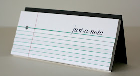
This is what I've been stamping on for the past half year. A friend in our local crafting group gave us a great idea to use old spiral-bound notebooks when stamping. They provide a little cushion to stamp on which helps pick up finer details (vs. a hard table), and they can be used for scrap paper (without all those little pieces floating around and making a mess). I always test things out before putting them on a card, so these pages tend to get filled up weekly. A benefit that I recently discovered is that it's a neat history of your projects. Flipping through you can see exactly what you were working on and when, what didn't turn out so well, etc. This page has the "thanks" stamp from this card, the "just a note" from the card in this post, a bee and washi tape from this post, a medallion for a future post, and some squares from the recent CASE this Sketch that I abandoned and never made into a card. I have craft ADD so it's also a good way for me to record my ideas for things I want to work on in the future.

Anyway, back to the card ...

  This one is 8 1/2 x 4, sized to fit in a standard long envelope. It's made of one wide box, and several 1/2" wide boxes. Same measurements as my piece of notebook paper. The tiny boxes turned out to be difficult to fold straight. I was nervous stamping the sentiment after all the work folding the boxes, and since the "j" crossed below the line. I made a pencil mark on the lower box where the tail of the "j" should go, stamped it a second time, and it lined up fine.


 Here's a side view. The hole in the margin of the notebook paper was hard to get since it crossed boxes. I did two half punches on each box. Also, the blue lines are from coloring the INSIDE of the boxes blue, so when they are put together your eye sees a faint colored line, but it's not a drawn line.

In my head I thought it would be quick to fold a bunch of boxes and attach them all. Not bad, but not very quick either. Oh well, it was fun to play around!

Thanks for looking!
-Kelly

Wednesday, January 23, 2013

A Study in: Boxes (Antique Bottles)


 Here's another card carrying the same theme as the cards in my last post, but this time they are a little different. No longer square tiles, but antique glass bottles.

 Inspired by a fun card featuring bottles by Amber Kemp-Gerstel at CASE Study (which I just missed, rats!):


AND the blues in the Tuesday Trigger (see that ONE orange flower on the night stand too, I think?!):

 
AND my collection of antique bottles:


AND my kitchen backsplash:


 Here you can see the bottles on the counter the night before my son's 1st Communion party last year, just waiting for the fresh lilies of the valley that take over every Spring. You can also see the Quatrefoil back splash that our tile guy cursed. Apparently, no straight edges + tile guy's friend giving the estimate while he's on vacation = grouchy tile guy. I gave him a large tip, it turned out really well, although now I'm wondering if I should have used a light gray grout so it relates to the dark granite better. And if we weren't looking to move soon, I would paint the cabinets in Paris Gray Annie Sloan Chalk Paint with a plain wax finish. Oooh, that would be so pretty ... OK, wait, we're talking cards here ...


The bottles and woodgrain shelf are made like the tiles, only they are different sizes. Simply score a length of paper at the increments you want (I used 1/4" and 3/8" thicknesses) and fold into a box. Before you adhere it closed, you'll want to emboss the patterns into the glass, and the woodgrain texture into the shelf. 


 That's where the Papertrey Ink Quatrefoil Cover Plate Die comes into use, only this time it doesn't go through the die cutter. Carefully place the top section of your box over one of the segments, and dry emboss. You can also score basic lines at the tops and bottoms of the bottles for further effect.


 Slide the bottles down in either direction, fold the shelf on top of them all, and you've got a card that can easily be stuck inside an envelope to mail.


The Stripes Impression Plate makes a nice beadboard effect. The flower is a left-over from one of my very first card posts. Right now it's just stuck loose in the vase.

Also adding this to the CASology cue word of "Drink" after I saw Ardyth's clever-as-always interpretation:


Thanks for looking!
-Kelly