Monday, February 25, 2013

Papertrey February Blog Hop (Quatrefoil Ombre Monogram)


 Many of you know I have a lot of left over quatrefoils, so I wanted to put them to good use at Papertrey's monogram blog hop today.

Here's the complete project. I'd like to think it's for my craft room because the springy colors make me happy. But realistically I would need a free 8" of horizontal space to set it up. So, let this be my motivation to clean, purge, and refresh!


Here's the quatrefoil die. Each flower is made from one of the rounded quatrefoil shapes. If you'd like to see how, I have a step-by-step photo for a similar flower at the end of yesterday's post. This flower is even easier though, you just need to cut along the lines shown and then fold the petals upwards.


Here's a closer shot so you can see the 3D flowers making up the monogram.


One of the reasons I like these flowers so much is that they're all 3D and flowery, yet when you look at them head-on, they are squares. And they fill the background with that same color. Perfect for an ombre treatment.


 Thanks so much for looking!
-Kelly

Papertrey Ink February Blog Hop

 
 Totally a traditional medium for the monogram theme at Papertrey's blog hop this month ... a personalized card.

Although it's traditional, I was hoping to create interest by combining different colors together (ice blue/orange/yellow/gold is a first for me), textures and papers. That gold embossing trend is growing on me.

Keeping it a short post because I know you all have a ton of inspirational hopping to do. Can't wait to see what you've done! I've got one more monogram home decor project that I've posted this morning.

Thanks so much for looking!
-Kelly

Sunday, February 24, 2013

A Study In: Quatrefoil (whole die)


Yep, it's more Quaterfoil! I've picked 4 different challenges and created 5 cards after trying out different ways to use the whole Papertrey Quatrefoil Cover Plate die, or sections of the whole die.


 I thought I'd do a simple design and try out the 10 minute Craft Dash challenge with their color scheme. This card took 8 minutes, 23 seconds. Ran it through the Big Shot, used an exacto knife to cut across the top and bottom of a pair of quaterfoils, glued the die to the card base, stamped the sentiment, grabbed a pink quatrefoil from my bag of leftovers, cut to make a flower, and added a rhinestone colored with a blue marker to the center. Super quick for me. I'm a sloooow card maker. Too many decisions. So, good thing the 20 minutes thinking about what to do does not count in this challenge! Or the 3 other cards that I wasn't happy with : ) 


Since it's such a simple card, I used a really thick, pearl-finished, cover sheet to die cut.


How about cutting strips of the die for a card? That's what came to mind when I looked at the CASE study inspiration card by guest Teri Anderson.


Looking to my scrap bag once again, I pulled out random, colorful quatrefoils and plugged them into the white frame. You could make some really neat patterns using this approach. The top strip on my card has a zig-zag pattern, the middle strip has a boxy pattern, and the bottom strip has a dotted pattern. Use any one of these patterns in multiples and I'm sure it will make for a fun background or design element.
 

Here's the small section I used to make the card above. In fact, there were even two strips leftover so I made another quick card:


Hard to see, but the "wow, that's fantastic!" is gold embossed. So surprised that I'm liking that trend.


Next is a card using Karolyn's versatile sketch at CAS(E) this sketch.


The quatrefoil is definitely playing a supportive role in this card. I've always thought the pattern looked "quilty," like on those fake quilts that just have an overall stitched pattern down the length of the quilt. So I ran it through to emboss instead of cut and made a bed out of it. The top of the quilt is folded over to show the solid side of the paper. Like the other box cards, this one folds flat for mailing and storage too. The matching sentiment is from the Hero Arts "Mi Casa" set.

I'm super happy with the wood flooring. The varied widths of wood paper are edged with a brown marker to give them more definition. The corners are snipped off, and brown dots are for the nail holes. 

This is the floor I'd love to have in my real bedroom!!


Here's a close up of the side of the bed and the wood planks. Too much glare, but you can get the idea.


One more card, this time focusing on the CAS-ual Fridays challenge to use silver on your card.


Hammered silver is used for the quatrefoil die, and then I wove 1/2" strips of paper through the frame. Unlike when I wove wider lace through the frame and ended up with a funky checkerboard pattern, this time I got a diagonal striped "x" pattern. Fun! No pressure stamping the sentiment on this card, because if you mess up you can just slide out the strip and do another one.

The flower is made from a quatrefoil too.


Just cut along the pencil lines until you are close to the center. The first couple I drew lines for, but after I made lots more of them (for a post later this week) I just eye-balled it to save time. You can actually get two different sizes from this shape, depending on which sections you cut off. For a large bloom (top row) cut the smaller, corner pieces out. For the smaller bloom, cut the larger, rounded pieces off, and then round the remaining corner pieces. To make the flower I colored the pieces with marker and stacked them.


Thanks so much for looking! Stay tuned for two more quatrefoil posts this week : )
-Kelly


Previous posts in this series:
 Die within a Die
Positive Shapes
More Positive Shapes,  
Negative Shapes 

Future posts in this series: 
Another Positive Shape
3D Shapes

Monday, February 18, 2013

Tuesday Trigger: I've a Notion


Shhh ... it's another quatrefoil card that's supposed to be for a future post, but the Tuesday Trigger is ending any second now, so I'm sneaking it in. Wove the lace through and who knew there is a funky checkerboard pattern in that darn quatrefoil die?! Lace is not my go-to supply, but that's what makes for a good challenge.

The gray/melon/cream color scheme, lace, and button are all inspired from the Tuesday Trigger inspiration photo:


Thanks for looking!
-Kelly

Sunday, February 17, 2013

A Riddle for You

Here's a riddle that I made for a teen boy's birthday card. Although, as my husband commented to me, this is more of a verbal joke than a print joke. But that's OK. Who knows the answer? I'll post the inside of the card when someone gets it right. It was Mom's favorite go-to joke when I was little : )

Totally inspired by Ardyth's graphic typography card from the CASology challenge to use RED.
 

Also inspired by the CAS-ual Friday's challenge to use Black & White plus a color (totally a literal interpretation on this one!!!) 


Thanks for looking!
-Kelly


ETA: Jenny's the smart one! I went with the classic answer, although there are quite a few versions that came out afterwards, like "a sunburned zebra." Here's an updated list I found on the internet. 


Friday, February 15, 2013

A Study in: Quatrefoil (negative shapes)


First of all, super-exciting news to finally share (I am pretty good at keeping secrets, but it still drives me crazy to do so)! 


Seeing that email from Michele asking if I'd like to be a Girl Friday (um, hello, YES!!) was such a thrill. I've always thought the CAS-ual Fridays challenge is top-notch, and then to be a part of it ... wow! And now that Michele has started her CAS-ual Friday Stamps company I'm so anxious to play with her fun/trendy/versatile stamps! When I saw the insanely talented group of designers who are also joining the team, I was even more excited, and then immediately panicked. Holy cow, I'm going to have to make some darn good cards! Seriously can't wait to get started.


Here's the bouquet my decades-long girlfriends from Jr. High sent me to celebrate, isn't that so sweet of them?!? Thanks Golden Girls!!!

OK, thanks for letting me share. Back to the post ...

If you're new to my blog, you've landed right in the middle of a series of posts focusing on several different ways to use the same die ... Papertrey's Quatrefoil Cover Plate die.


This post will feature cards made with the negative portions of this die, combined with one of this week's challenges. First up ...


Looking at the photo at Runway Inspired Challenge this week, I see one tall, pink object on the left with white inside, and several layers of smaller, neutral items mostly on the right, but crossing over the pink.


 I tried to keep the same elements that I saw in the photo on my card. A tall, pink object with white inside, and the shorter, layered objects on the other side. Due to the grays, I made this a sympathy card. The pure, white vine moving upwards also worked well for a sympathy card.

It's pretty easy to see where the quatrefoil comes from on this card, right? I just cut a strip from the middle and that was that. Instant trellis. I cut apart a Memory Box Flutter Vine die (which is a clump of leaves) and pieced it back together to make the vine climbing up the trellis.


Next up are the soft colors at The Play Date Cafe. I have to admit, I was going to pass on this one because I don't usually use pale colors. But then I came back and gave it a try.


The flowers are cut from patterned paper and arranged on the mint cardstock. For this card it's less obvious where the Quatrefoil comes from. Can you tell? It's where the rounded bumps of the quatrefoil shapes meet one another. In an earlier post I used these intersections as "X's" on a XOXO card. But for this card, I lined up the longer X's (going vertically on the die) and made an interesting border. On the white side of the border, I used my hole punch to remove the mint green sections. The punch happened to be the perfect size.


Next up is the Camera Craze Challenge at Moxie Fab (this photo is from the additional inspiration on Cath's pinterest board). When I saw this challenge, I REALLY thought I need to skip it for my quatrefoil study. But then I had an idea ...


Maybe they'd make some pretty cool bellows if I stacked and slightly offset them. And MAYBE I could even use those odd, end pieces with the straight edge. Since I was going to be taking major liberties with making my camera out of these quaterfoil outlines, I decided to use some fun colors and make it a modern-ish camera. That's where the sentiment comes from too. I have an 85 year-old aunt who is just gorgeous and so fashionable (used to be a model) and very "old school cool." If she was a camera, it would be this one : )

For the "old school" sentiment, I felt kinda naughty only tapping my letters into the ink pad once, and very lightly at that. But I wanted an older look for that part of the sentiment, to contrast with the more modern "cool." Just like the worn texture at the top vs. the modern pattern on the bottom.


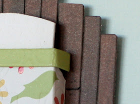
The quatrefoil outlines all being the same size made it difficult to construct the bellows. So I made an extension of the bellows in black cardstock that I could graduate in size. I also like the fact you can see some of the other side of the quatrefoil outline, making it look a little more 3D.


OK, one more! This one is inspired by Dawn McVey's sunshine card in the middle right for Papertrey's 6 year anniversary.


I used similar colors,and made it into a full circle. Remember the pink trellis card? That's what makes up this card. A bunch of quatrefoil outline strips rotated to make a circle. Again, the part that I think is going to be bothersome (the ends where there's not a full quatrefoil shape) turns out to be the best part! The straight edge at each end makes a nice circle when they are all lined up.


I started adhering them together in the middle to get the spacing right, and afterwards ended up liking how the ends curl outward a little. So I left the ends loose for now. I think it's an added layer of interest.

Thanks so much for looking, and all of your kind comments along the way!
-Kelly

Previous posts in this series: Die within a Die, Positive Shapes, More Positive Shapes
Future posts in this series: Whole Die, 3D Shapes

Tuesday, February 12, 2013

Insipired by Family Magazine Post: Golf Ball Valentines

Only two more days until Valentine's Day, but I had to share our Valentines for this year. You may remember we made Nerds box wrappers well ahead of time. THEN I found out that candy is prohibited at our kids' school for Valentine's Day. Arrgh! So I had to come up with something quick, yet still be cute and fun. 


I had my answer after walking down Walmart's sportswear aisle. They're:
  1. quick (20 in 25 minutes);
  2. easy (just print and cut);
  3. cheap ($2 per set of 15);
  4. one-of-a-kind (that I know of, based on a google search); and
  5. punny.

Wanna check them out? Click here for the article, step-by-step, and free printable.

Thanks for looking!
-Kelly

Monday, February 11, 2013

A Study in: Quatrefoil (more positive shapes)


If you're new to my blog, you've landed right in the middle of a series of posts focusing on several different ways to use the same die ... Papertrey's Quatrefoil Cover Plate die.

I had a few more ideas for using the positive shapes from the Papertrey Ink Quatrefoil die, and then I'll move on to the negative shapes in a subsequent post.


First up is a card inspired by a sketch from the 6 year anniversary celebration at Papertrey Ink. 


This card uses a bunch of the white quatrefoil shapes attached to a punched circle. To me, it kinda looks like a mum due to all the tiny little knobs you see from the quatrefoils. The center is a furry fiber wound up and attached so the ends stick out. So loving the white, embossed sentiments these days. Especially on gray.


 Next is a "just because" project. I still have a billion some left over shapes and just stuck one on a tag with a button and sentiment from Tiny Treats. Done. When I'm finished with this series I will end up keeping the leftovers in a ziploc bag. Does anyone else do that? I store all leftover shapes for each die in ziplocs. Alphas all get stored in the same bag. It's quite a mix now.


Next is a card for CAS-ual Fridays challenge to be inspired by a song. Thinking about this on the way to my son's preschool, my song became the ever-popular, "Ring Around the Rosie." It actually inspired the white mum card above and the tree card from the last post too.


 One of the moms at the preschool drop-off had a pink bag with navy and green details. Loved it. Totally says "Spring" to me. You may notice that this arrangement is a little different than the white mum card because it uses the odd quatrefoil pieces at the left and right ends of the die. See how the 4th edge doesn't have a bump on it? Before, I threw all those away because they were a deformed quatrefoil shape, but in this case that straight edge works perfectly to define the inside of the wreath shape.


 This last card is inspired by a celebrity card-maker hanging out CASE Study for this whole month. Paper Crafts Go-To-Gal Teri Anderson is the muse and offered this fantastically graphic card for inspiration.


 Here's my take on it. Love the big, overlapping, alphanumeric symbol and repeated text in Teri's card, so I've incorporated both elements here, as well as stayed pretty close to the overall layout. (note: I got the "2" from my bag of leftover numbers, such a time-saver, and I probably wouldn't have thought to use the felt if it wasn't there already.)

You didn't think I forgot the quatrefoils, did you? For shame. Can you see them?


They are used as the interlocking background for "bir-th-day." They nestle quite nicely into each other if you cut a little bit off of each side. Not perfectly, but I rather like that. In this case it works to join the different parts of the word together.

Well, that rounds out the cards made with the positive shapes. Stay tuned for the negative shapes, then the whole darn thing, then 3D shapes. You will be SO TIRED of this die by the end of the month : )

Thanks for looking!
-Kelly


Previous posts in this series: Die within a Die, Positive Shapes